


DeFi Lending Platform
Bakery Finance DAO, 2023
Overview
Bakery Finance is a decentralized lending platform where users can participate as depositors or borrowers. It allows users to supply assets and earn yield or borrow by providing collateral. Bakery Finance is a side project of Fluid Finance SA.
Bakery Finance needed a web platform with an easy-to-use user interface and experience. The goal was to launch the platform in 30 days, leaving little room for design.
Research
The stakeholders provided their deep understanding of the industry, vision for the product, and references.
I conducted a competitive analysis to identify commonalities among competitors and gather valuable insights for building our product.
User flow
I created a visual user flow to align with the team on feature functionality before designing the interface.

Mockups, design system, branding
I established the design system and created all the screens for both web and mobile views. All components were developed based on Atomic Design principles, utilizing interactive variants.
Prototyping and testing
I built a Figma prototype covering all the main scenarios of the product for usability testing and presentation to stakeholders. It was created with interactive components and variants.
The video below is a screencapture of walking through the prototype. Also you can try the prototype in Figma by youself!
To recruit real users for usability testing, I conducted a survey in our product’s crypto community, asking about their experience with DeFi applications. Following this, I requested via email interviews with those familiar with lending protocols. 161 community member took part in the survey, 7 usability tests were conducted via Zoom.
During each call, I shared a link to the prototype and asked users to walk through the main JTBD scenarios:
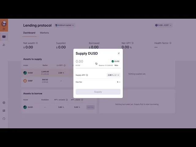
Supply funds
Borrow funds
Withdraw funds
Repay funds
After each interaction, I inquired about what they observed, what actions they wanted to take, and what outcomes they expected. Subsequently, I asked if the actual results aligned with their expectations.
Finally, at the conclusion of each call, I solicited feedback on what aspects they found effective and what areas could be improved.
Despite one issue, all users successfully completed the scenarios, and the overall feedback was positive. Users found the flow easy to understand, navigate, and completed their JTBDs.
Fixing bugs
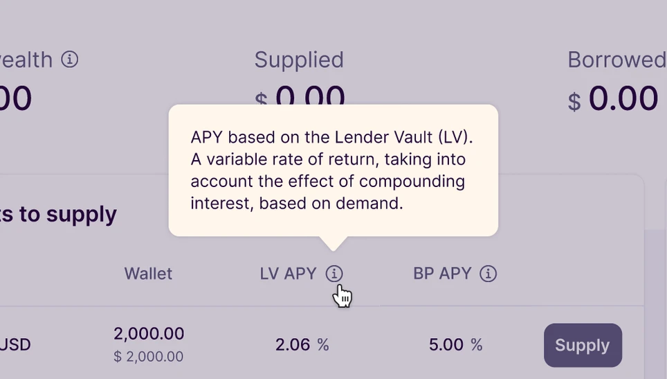
One significant issue arose during usability testing: users struggled to access explanations for specific terms, which were provided upon clicking the 'i' icon. Although users noticed the icons, they didn't immediately click on them, resulting in delays in understanding the terms.
To resolve this issue, I adjusted the trigger for displaying the hints to appear upon hovering over the 'i' icon. This modification ensured that users could easily discover the useful information hidden behind the icon.